The short version is, blue can work really well in Orange NSW, but you need to test it properly before you commit. In our local light, blue often looks brighter outside, cooler inside, and a bit sharper than it did on the sample card. Softer options like Taubmans Team Spirit are usually easier to live with, while brighter or moodier blues need a bit more care in where and how you use them.
Micro takeaways
- Orange’s light makes blue look different from what you see in-store.
- Softer blues are usually easier to live with than very bright or very dark ones.
- Start with Taubmans, then compare only if you need to.
Orange NSW sits close to 900m above sea level, so the light is clearer, cooler and the UV is stronger than what you’ll get on the coast. That means exterior colours can read lighter and flatter in full sun, while interiors can feel colder in winter shadow. In the 2026 blue direction, shades like Taubmans Team Spirit, Dulux Slow Swing, Dulux Mellow Flow, and brighter blue directions often described as luminous blue still have potential, but they need proper testing in local conditions. I re-checked the current 2026 blue conversation and the general takeaway still holds. Energetic, cleaner blues are around, but for Orange homes they usually work better as accents or in carefully balanced spaces than as a whole-house default. If you want a sensible starting point, I’d put Taubmans first, then compare from there so you don’t end up chasing a colour that only looked good under showroom lighting. The safest move is always to test large samples in morning sun and late afternoon shade before you commit.
If you’ve spent a winter morning watching the sun rise over Mount Canobolas or an autumn afternoon under the poplars in Cook Park, you already know the light in Orange is different. At nearly 900 metres above sea level, the air is thinner, the UV is higher, and colour can look sharper and brighter than expected.
As a painter in Orange NSW, I’ve seen plenty of homeowners fall in love with a swatch in-store, then feel disappointed when it goes on the wall at home. That happens a lot with blue. It can shift fast depending on light, aspect, room size and surrounding materials. At CWP Painting, our in-house qualified painters, no subcontractors, use that local knowledge to help homeowners make smarter choices before the paint goes on.
Choosing the right paint isn't just about what looks good on a trend card. It’s about how the colour behaves in your home, in your street, and through a real Orange winter. With 40+ years of local experience across Orange and the Central West, we’ve seen what works, what feels too cold, and what holds up over time.
Why Blue Paint Looks Different in Orange
Before you pick a colour, it helps to understand what the local light is doing. In the Central West, we sit higher up, so there is less atmosphere filtering the sun. That gives you cooler light and stronger UV than many coastal areas.
What does that mean for your paint? For one thing, colours often look lighter on exteriors than expected. A deep navy can land closer to a mid-blue, and a soft grey-blue can suddenly feel much cleaner and brighter in full sun. Inside the home, long winter shadows can make cool colours feel harder and flatter if you haven’t balanced them properly.
That’s why residential painting in Orange NSW needs a local eye. It’s not just about the fan deck. It’s about how the colour reacts on your walls, with your brickwork, roofing, timber and orientation. If you are comparing painters Orange NSW homeowners can call, colour advice backed by local experience makes a real difference.
Micro takeaways
- Orange’s altitude and UV change how blue paint reads.
- Exteriors usually look lighter in strong sun.
- Interiors can feel cooler in winter, especially in shaded rooms.
If you test colours the same way you would at the coast, you can get caught out. In Orange, local conditions are part of the colour decision.
The 2026 Blue Shades Worth Testing First
The 2026 blue trend gives you a few very different directions, and that’s where people can make expensive mistakes. A blue that looks calm on a trend board can feel far too sharp once it hits an exterior wall in Orange sun. On the flip side, a darker blue can look rich and grounded in one room, then heavy and gloomy in another.
I also re-checked the talk around 2026 blue naming and direction. Terms like Luminous Blue are being used around cleaner, more vivid blue stories, while Team Spirit still fits the softer, grounded end of the spectrum. That matters in Orange. A luminous blue direction can look fresh and modern here, but our light tends to push it harder, especially on west-facing walls and exterior surfaces. Team Spirit is usually easier to settle into because it carries a bit more restraint and warmth by comparison.
Micro takeaways
- 2026 blue trends range from soft and earthy to bright and high-energy.
- In Orange, cleaner blues often look stronger than expected.
- The right trend colour still has to suit your home’s light and materials.
1. Taubmans Team Spirit, a softer earthy option
If you want a blue that feels current without going too cold, Taubmans Team Spirit is worth a serious look. It sits nicely within the more grounded 2026 direction and gives you a softer, more settled result than a high-energy bright blue. It’s also a good reminder that the loudest colour on the card isn’t always the smartest one on the wall.
- Best use: Living rooms, bedrooms, studies, or a controlled feature wall.
- The Orange factor: Team Spirit tends to feel more settled in Orange light, especially when paired with warm whites, timber and natural stone.
- Good place to start: If you want to browse the broader colour range first, start with Taubmans.
2. Dulux Free Groove, best kept for accents
Free Groove is vibrant and full of energy. It sits closer to that cleaner, more luminous blue mood people are talking about in 2026. It can look fantastic, but in the high UV of the Central West it becomes very strong, very quickly.
- Best use: Front doors, cabinetry, small joinery details, or a carefully chosen feature.
- The Orange factor: On a large exterior wall, it can feel overcooked. Used in smaller doses, it looks crisp and modern.
3. Dulux Slow Swing, for darker and moodier spaces
Slow Swing is a deep navy with real presence. It suits cosy rooms and can look excellent in a media room, bedroom, or tucked-away sitting space.
- Best use: Bedrooms, media rooms, and selected exterior accents.
- The Orange factor: In a south-facing room it can get moody fast. If you’re using it outside for exterior painting, you need the right system and careful prep to handle heat and movement.
4. Dulux Mellow Flow, the easy all-rounder
Mellow Flow is pale, soft and easy to live with. For many Orange homes, it’s the least risky of the group.
- Best use: Open-plan areas, hallways, bathrooms, and smaller rooms that need to feel lighter.
- The Orange factor: In morning light it can almost glow. That makes it a strong option for cottages, family homes and residential repaints where you want a fresh finish without going stark.

Micro takeaways
- Taubmans Team Spirit is a strong option if you want an earthy blue that feels softer and more grounded.
- Free Groove works best as an accent in Orange because our light pushes it brighter.
- Slow Swing suits moodier rooms but needs careful placement.
- Mellow Flow is often the safest whole-of-home option.
Pick your blue based on where it’s going, not just the name on the colour card. In Orange, placement changes everything.
Make the Colour Work With Your Home, Not Against It
One of the biggest mistakes in residential painting is choosing a blue in isolation. Your walls do not sit on their own. In Orange and the Central West, they sit next to brick, stone, Colorbond roofs, warm timber and older masonry that all influence the final result.
Micro takeaways
- With basalt, bluestone or charcoal masonry: Softer blues like Taubmans Team Spirit and Dulux Mellow Flow can look clean and balanced without fighting the darker materials.
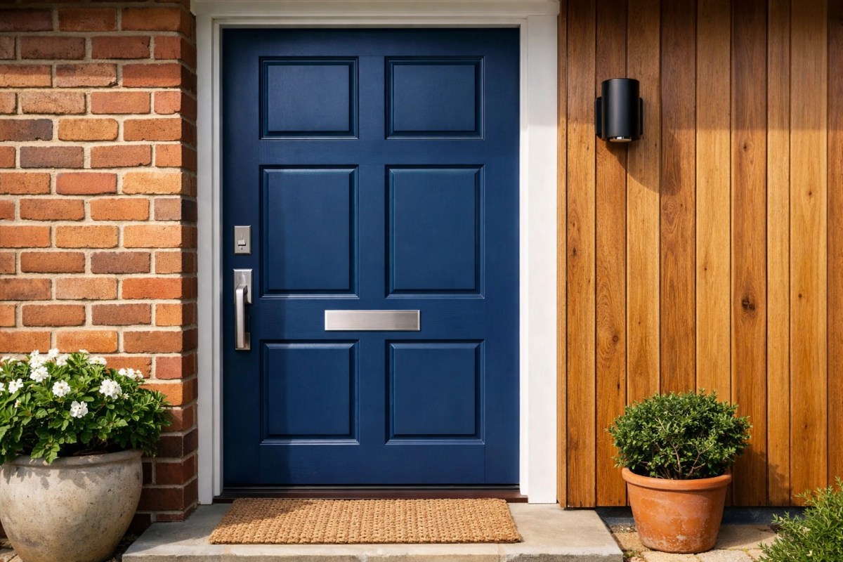
- With red or orange brick: Stronger blues like Dulux Free Groove can work well in small amounts, especially on doors or shutters.
- With warm timber: Timber helps stop blue feeling cold. That’s a big win in Orange homes, especially through winter.
- With renovation work: If you’re updating an older home or planning a restoration or renovation project, a well-chosen blue can help connect original features with a fresher finish.
Micro takeaways
- Match blue paint to the fixed materials around it.
- Warm timber helps balance cool paint colours.
- Stronger blues usually work better as accents on brick homes.
When the surrounding materials are right, blue looks deliberate and well resolved. That’s what gives you a result that feels settled, not trendy for the sake of it.
A Good Colour Still Fails If the Paint System Is Wrong
Obviously, picking the colour is only half the job. In Orange, UV is hard on exterior paint and dark colours can cop extra heat load. If the prep is average or the product choice is wrong, even a great colour can fade, move, or wear poorly.
Micro takeaways
When we talk clients through our painting process, we focus on the full system, not just the top coat. That means proper preparation, the right primers, and premium products suited to local conditions. We generally recommend starting with Taubmans when you’re reviewing colour directions and product information, then comparing other options if needed. A decent colour is one thing, but the right system is what stops it becoming an expensive learning experience. If you also want to check industry standards and professional guidance, Master Painters Australia is a useful reference, and NSW Fair Trading is worth checking for consumer guidance, licensing information, and practical protections before any home improvement work. The product needs to match the substrate and the colour depth.
Micro takeaways
- Blue paint can struggle if the prep and coating system are average.
- Orange UV puts extra pressure on exterior colour durability.
- Darker colours need more thought on heat, movement and product choice.
The colour gets the attention. The system is what protects your investment over time.
How to Test Blue Paint Before You Commit
Chances are, you want to get moving once you’ve found a few colours you like. Fair enough. But this is the stage where a bit of discipline can save you a repaint.
Micro takeaways
-
Ignore the tiny swatches
They’re useful for narrowing things down, but not for making the final call. -
Buy sample pots and paint large boards
Aim for at least 60cm x 60cm so you can actually see the colour properly. -
Compare brand options side by side
If you like one Dulux blue, test a Taubmans equivalent as well. For example, if you’re drawn to a soft earthy blue direction, put Taubmans Team Spirit alongside Dulux Mellow Flow or Dulux Slow Swing and see which one sits better in your home. -
Move the sample around
Check it in morning sun, midday glare and late afternoon shade. Blue can shift a lot in Orange light. -
Watch how the colour bounces
In smaller rooms, blue reflects back into the space and often looks stronger once the whole room is painted.
Micro takeaways
- Large samples beat small swatches every time.
- Start with Taubmans, then compare other options side by side before choosing.
- Check the colour at different times of day and in different rooms.
Ten careful minutes with a sample board can save you a lot of money and frustration later.
Why the Finish Matters Just as Much as the Colour
Deep blues and stronger feature colours can be tricky to apply well. They show lap marks, uneven build and patchy coverage much faster than a forgiving white or neutral.
At CWP Painting, our in-house qualified painters, no subcontractors, handle this sort of work every week across Orange and the Central West. That matters because the final look comes down to technique, consistency and preparation, not just the colour name on the tin. With 40+ years of local experience, we know where blue paint jobs can go wrong and how to get a cleaner, more durable finish. In residential painting, a sharp finish is what makes the room feel intentional and high quality.
Micro takeaways
Micro takeaways
- Strong blues highlight patchiness and uneven application.
- Good prep and consistent application make the colour look clean and solid.
- In-house qualified painters give you better control over finish quality.
Blues can look fantastic. They just need to be done properly if you want the result to feel premium.
A Smart Blue Choice Can Add Long-Term Value
The great thing about blue is that it can feel current without being a short-lived fad. If you choose a shade that suits Orange light and fits the rest of your home, it can lift the whole space and still feel right years from now.
Micro takeaways
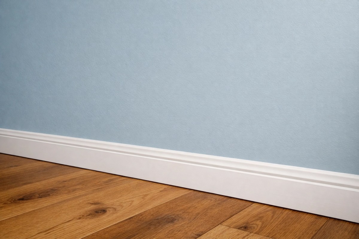
That’s especially true in residential repaint work. A calm blue in the right room can freshen up a tired interior, help a home feel more considered, and support presentation if you’re preparing for sale. If you’re planning interior painting, the best result comes from getting the colour, prep and finish working together.
Micro takeaways
- Blue can age well when it suits the home and the local light.
- Long-term value comes from prep, product choice and finish quality.
- A controlled blue can modernise a home without making it feel risky.
Choose a blue that behaves well in your space, then back it up with a proper painting system. That’s what makes it last.
Pro Tip
When choosing 2026 blue paint colours, don't just rely on indoor lighting. Take your samples outside at midday as well. In the Central West, UV and clear light can shift a colour more than people expect, so you want to make sure your blue still feels balanced in direct sun and winter shade. If you're comparing brands, start with Taubmans first, then check other options beside it on the same board so you're judging the colour fairly, not the showroom display.
Final takeaway
If you want blue paint to work in Orange NSW, don’t choose it on trend alone. Test it in real light, start with Taubmans as your primary reference point, and make sure the finish is backed by the right prep and product system. That’s how you get a result that looks good now and still feels right in a few years. Otherwise, that “perfect blue” can turn into a very confident mistake.
Ready to choose a blue that suits your home?
If you want help narrowing down the right blue for your place, I’m happy to talk it through with you. At CWP Painting, we’ve got 40+ years of local experience in Orange NSW, we’re fully licensed and insured, and all work is completed by our in-house qualified painters, no subcontractors. That means you get a consistent standard from a local team that knows how Orange conditions affect real residential painting work. If you’re planning residential painting in Orange or the Central West and looking for painters Orange NSW property owners can rely on, get in touch here and we’ll help you take the next step.
FAQ
Do paint colours really look different in Orange NSW?
Yes. Orange’s altitude, clear light and higher UV can make blue paint look brighter outside and cooler inside than it would in many coastal areas.
Is Taubmans Team Spirit a good option for Orange homes?
Yes. It’s a softer blue that can feel more grounded and easier to live with in Orange light, especially when paired with warm timber, stone, or off-white trims.
What does Luminous Blue mean in 2026 colour trends?
It usually refers to cleaner, brighter, more energetic blue directions. Those shades can look fresh and modern, but in Orange they often read stronger than expected, so they need careful testing.
Is Team Spirit safer than a brighter blue in Orange?
In a lot of homes, yes. Team Spirit is usually easier to control because it feels softer and less aggressive in strong local light.
Which blue is the safest for most residential interiors?
Taubmans Team Spirit is often the easier starting point if you want something softer and more grounded. If you want a lighter all-rounder, Dulux Mellow Flow is another option that tends to stay fresh without feeling too heavy.
Is Free Groove too bright for an exterior?
Often, yes for large areas. In Orange sun it can look stronger than expected, so it usually works better on doors, shutters or small accents.
Will dark blues fade faster in the Central West?
They can if the paint system is average. Proper prep and premium products make a big difference to how well the colour holds up.
Should I test more than one brand side by side?
Yes. Start with Taubmans, then compare other options in the same space if needed. It gives you a much clearer idea of what actually works in your home, and it helps stop a showroom crush from becoming a whole-house commitment.
Do darker blues need a different exterior system?
In many cases, yes. Dark colours absorb more heat, so product choice and preparation matter more.
Why use a professional painter for blue paint?
Blue is less forgiving than many neutrals. It can show patchiness, lap marks and uneven coverage, so a professional application usually gives you a cleaner and longer-lasting finish.

